NHBR About Town: Week of July 17, 2026
Business and event happenings around the state of NH

You may have noticed by now that NH Business Review has undergone a complete redesign. (Considering this is the second issue featuring our new look, I sure hope you did.)
We’ve long taken pride in the quality of the reporting and analysis NH Business Review has offered our readers over the years. And now we think we’ve put together a design that matches that quality – one that’s eye-catching and easy to navigate.
Our staff spent the better part of six months going over every page of the publication, from our logo to the Flotsam & Jetsam page, all with the goal of making NH Business Review a more entertaining, informative and pleasurable reading experience. Our editorial and production teams questioned and examined everything about the publication, from its look and font to the color palette and the kind of paper we’re printed on.
We’re very pleased with the result, and judging from the dozens of comments we’ve received from readers and advertisers, they are too – unanimously.
There’s something else about this redesign that I think is important to point out: It shows that print has not gone the way of the Concord Coach. While we take great pride in our website, NHBR.com, I think the redesigned NH Business Review shows how powerful print is at giving readers a more complete, fulfilling and even enriching experience.
As anyone in the media business knows, we’ll be continuing to make changes in the publication over the coming weeks, and we hope you can help us as NH Business Review evolves. We welcome your guidance and feedback, comments and criticisms. You can send them to me at editor@nhbr.com.
I’m looking forward to hearing from you.
Jeff Feingold
Editor

Business and event happenings around the state of NH

The Latest is a roundup of the comings and goings of the movers and shakers in NH's business community
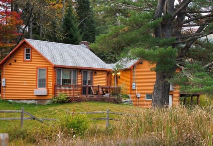
A decade after buying the property to redevelop it into a new generation of vacation cabins, the owner of Presidential Mountain Resort LLC (PMR) in Bethlehem has filed for bankruptcy protection in New York’s federal court, claiming more than $13 million in liabilities owed.

Failure to restore ACA tax cuts will only make things worse, according to U.S. Sen. Maggie Hassan

One of the things I enjoy most about working with New Hampshire business owners is hearing what they’re building toward. Whether it’s growth, succession or greater stability, our conversations are almost always about the future.

For many business owners, building wealth is closely tied to the success of the company. But as revenue grows and priorities shift, it can be difficult to know how much cash to keep available, how much to reinvest and when to begin planning for longer-term goals.

Succession planning for your business goes beyond naming the next leader. It involves preserving continuity for your employees and customers, as well as supporting the company’s long-term success.

As we close out Q2 and review the year so far, there are several interesting dynamics at play.

Londonderry’s Town Council is at odds over legal matters pertaining to hiring outside law firms to handle complaints and allegations of misconduct against the town manager.